logo-varonis_brand-white
Brandfolder Employee Brand Portal
  • About Us
    • Introduction
    • Taglines
    • Boilerplate
  • Visual Brand
    • Logos
      • Varonis
      • Partner program
    • Color
      • Principles
      • Primary colors
      • Secondary colors
      • Tints & shades
      • Neutrals
      • Extended palette
      • Gradients
      • Application Guidelines
    • Typography
      • Principles
      • Font stack
      • Type scale
      • Application guidelines
    • Iconography
      • Principles
      • Style
      • Application guidelines
    • Illustration
      • Product illustrations
      • Blog illustrations
    • Photography
      • Principles
      • In-line photos
      • Testimonial headshots
      • Do-nots
    • Patterns
      • Dot matrices
      • Extended pattern pack
  • Content Style Guide
    • The Varonis Style
    • Writing Tips
    • Products
      • Varonis products
      • Data protection
      • Threat detection
      • Privacy and compliance
      • Cloud security
      • Third-party and partner
    • Regulations and Terms
      • Privacy/compliance terms
      • Varonis certifications
      • Federal government terms
      • Finance terms
    • Glossary
    • Guidelines
      • Dates and times
      • Capitalization
      • Languages
      • Dashes
      • Widows
      • People
    • Summary
Your search returned no results

Typography

Clean, thoughtful typography can be the difference between communicating effectively and not communicating at all (literally). Readability and hierarchy are at the center of our type philosophy, with a bold — but highly versatile and readable — sans-serif topping our font stack.

BrandSite_Hero_Typography-1

Typographic principles

Hierarchy

Strive for strong visual hierarchy, with clear distinction between headers, subheaders, body text, and other key elements. The eye should be clearly guided through a piece of content. 

Readability

Avoid ultralight font weights that are difficult to read at small sizes or on small devices. Choose type sizes that maximize readability for each device type. 

Intentionality

Think consciously about the type decisions you’re making as you build a design. Avoid introducing too many font sizes or weights that aren’t reinforcing hierarchy, and stick to Graphik for all applications except those where some typographic contrast is needed.

Font stack

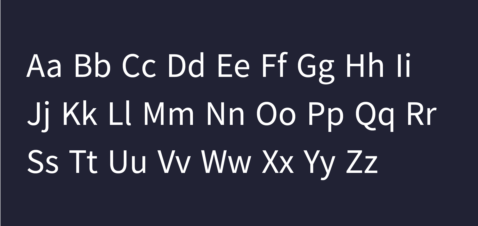
The Varonis font stack stars a versatile neo-grotesque sans-serif typeface, complemented by a distinctive mono font for visual accents.
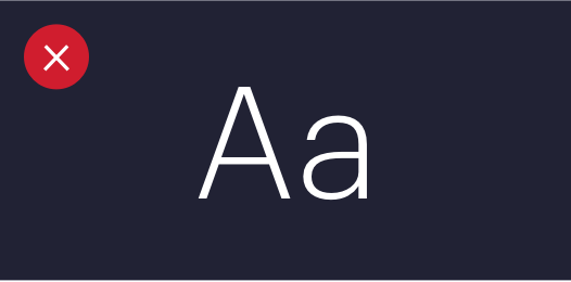
Brandminisite_Typography_2022_V1.1_Dark_FullSet_Graphik
Graphik

Graphik is our primary brand font. This versatile typeface can adeptly play any role, from bold landing page headlines to beautiful, publication-level content. Graphik is used for headers, body copy, display text, and more. The character set supports all Varonis-supported languages except Japanese.

Additional fonts

Brandminisite_Typography_2022_V1.1_Dark_FullSet_Bierstadt
Bierstadt

Bierstadt is our fallback Microsoft 365-safe font, used for presentations, spreadsheets, and Word documents.

Brandminisite_Typography_2022_V1.1_Dark_FullSet_Open
Open Sans

Open Sans is used in the Varonis product and is also approved for internal applications, sites, and products. Download it here.

Brandminisite_Typography_2022_V1.1_Dark_FullSet_Nato
Noto Sans JP

Use Noto Sans JP for Japanese-language content. Download it here.

Type scale

Use the following guidelines to create a visually appealing point size/leading ratio, reducing the ratio as the type gets larger, and opening it up as the type gets smaller.

Graphik

  • 60/64 We protect data.
  • 48/52 We protect data.
  • 40/46 We protect data.
  • 32/40 We protect data.
  • 24/34 We protect data.
  • 21/32 We protect data.
  • 18/32 We protect data.
  • 16/30 We protect data.
  • 14/24 We protect data.
  • 12/22 We protect data.

Application guidelines

Font weights

There are a limited number of approved font weights to ensure readability and clean visual hierarchy.
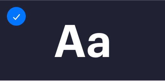
type-fontweights-graphiksemibold
Graphik Semibold

Use for headers and subheaders.
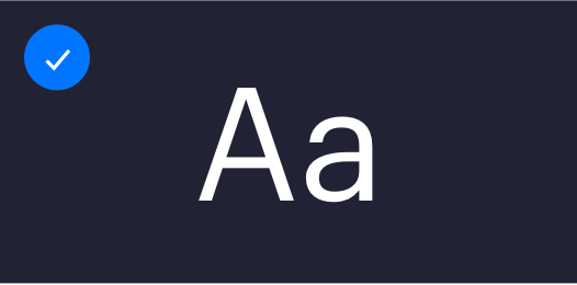
type-fontweights-graphikreg
Graphik Regular

Use for body copy, footnotes, boilerplates, and more.

type-fontweights-graphikbold
Graphik Bold

Use only in unique applications, such as non-standard branding, internal graphics, etc.
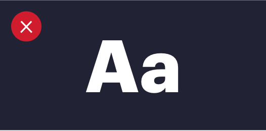
type-fontweights-graphiklight
Graphik Light

Avoid lightweight fonts. They were trendy five years ago, but now they’re just hard to read!

Color roles

Brand_Microsite_Color-01-1

Headers, subheads, body text, backgrounds

Brand_Microsite_Color-03-2

Headers, subheads, body text, backgrounds

Brand_Microsite_Color-04-1

Subheaders, text links, hover states, backgrounds

Brand_Microsite_Color-05-1

Dividers

logo-varonis-TriColor

Varonis is a pioneer in data security and analytics, specializing in software for data protection, threat detection and response, and compliance. Varonis protects enterprise data by analyzing data activity, perimeter telemetry, and user behavior; prevents disaster by locking down sensitive data; and efficiently sustains a secure state with automation.

Varonis Brandfolder Employee Brand Portal
©2023 Varonis
Legal Trust