Iconography
We use iconography to emphasize content in both print and digital content. Our style is mimimalist and linear, with a single-color application.
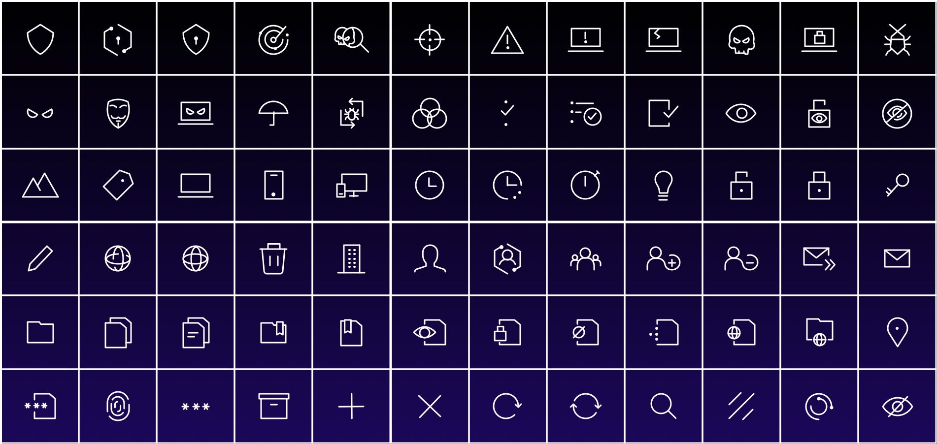
Style
Mini (standard)
Height: 30px
Stroke: 2px, round cap, round corner
Dot size: 3px (square)
Large
Height: 50px
Stroke: 3.3px, round cap, round corner
Dot size: 5px (square)
Color
Navy
Use on light backgrounds.
White
Use on dark backgrounds.
Electric Blue
Use on light or dark backgrounds.

Downloading this asset requires a Brandfolder account. To request access, click the button above.
If you are a non-Marketing Varonis employee, visit our internal brand site.